With over 63% of website traffic now originating from mobile devices globally, ensuring exceptional mobile experiences is mission-critical for modern brands. However, many sites still struggle to engage and convert mobile users at the same pace as desktops.
Adopting a mobile-first design approach represents the most effective way to close mobile experience gaps holding back performance. But what exactly does designing for mobile-first entail? And why does prioritizing the mobile perspective unlock better results across key metrics?
This comprehensive mobile-first design guide will get you up to speed on the methodology and equip you to overhaul desktop-centric sites. Let’s dive in.
What Is Mobile-First Design?
Mobile-first design means structuring the site experience expressly for mobile and smaller screens first before layering on any specialized functionality for desktop visitors.
This inverted approach forces simplicity while ensuring critical elements shine on mobile without excessive complexity or demands on device resources.
With the mobile-first design, brands:
- Structure site architecture and content flow for thumb-friendly mobile consumption.
- Restrict unnecessary modules/elements that complicate mobile use cases.
- Design interactions and gestures expressly for touch over the mouse.
- Size and space all templates for readability on small screens.
- Optimize web vitals like speed for unreliable cellular networks.
Only after the flawless mobile experience is locked down do teams address any differentiated desktop needs.
Elements nicely enhancing desktop – but unnecessary on mobile – get removed under a “mobile first, desktop later” mantra. Mobile experience efficiency becomes the North Star guiding all design decisions.
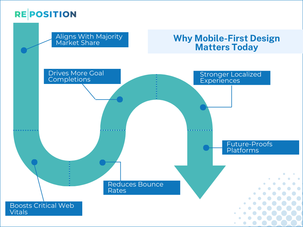
Why Mobile-First Design Matters Today
SShifting to a mobile-first design paradigm proves critical for strengthening engagement, conversions and long-term revenue growth. Mobile is driving an ever-increasing share of traffic and commerce, so optimized mobile experiences are now mandatory for capturing market share.
Consider these 6 core advantages of embracing mobile-first:
Aligns With Majority Market Share
Mobile devices including smartphones and tablets represent over 60% of site traffic for most businesses today. And this share is projected to hit over 75% by 2025 according to recent forecasts.
With a clear majority market share, mobile can no longer be an afterthought. If the mobile experience lags, brands diminish countless user interactions that now drive the bulk of volume and sales. Leading mobile commerce apps show the revenue potential of flawless mobile prioritization.
Boosts Critical Web Vitals
Core web vitals including page load speeds, engagement rates and bounce rates carry substantial search ranking weight today. Google has also rolled out mobile-first indexing making mobile site performance the primary ranking signal.
By streamlining mobile-friendly design, sites see significant lifts in speed and engagement metrics directly tied to higher organic visibility and traffic levels over time. Whereas poor-performing mobile drags down aggregate site-wide web vital health.
Reduces Bounce Rates
Extra tap requirements, typing friction and confusing journeys balloon bounce rates on smartphones. Mobile users have little patience for friction given on-the-go usage.
By tailoring sites expressly for seamless thumb interaction, minimising manual input needs, and optimizing readability, mobile-first design cuts this overwhelming friction substantially. Global brands have achieved 70%+ greater mobile session depths after mobile-first redesigns.
Drives More Goal Completions
M-commerce conversion rates continue to lag desktops. But with each conversion requiring users to battle through multiple pages, minimising mobile drop-off at each step drives exponential gains in end-goal attainment over time.
For example, e-commerce sites lifting mobile conversion rates of just 5% boost mobile revenue by 15-20% with larger cart sizes. More users reach key transactional endpoints like checkout and signups thanks to sustained engagement.
Stronger Localized Experiences
Location-specific mobile searches now dominate across commercial categories as consumers rely on smartphones for on-the-go research and buying.
Leading with mobile facilitates stronger personalization, localization and context-aware experiences catering to these “micro-moment” lookups. Brands claiming these moments outperform competitors.
Future-Proofs Platforms
Industry analysts fully expect global mobile adoption and sophistication to intensify as smartphone penetration grows, the 5G rollout expands use cases, and innovations like augmented reality and advanced IoT transform user behavior over the next decade.
By prioritizing robust mobile durability and flexibility now, brands future-proof experiences for the next waves of disruption – saving costly rework down the line. Mobile-first sites smoothly adapt as mobile continues rapid change rapidly.
Step-By-Step Guide To Mobile-First
Transforming desktop-first sites and flows into truly mobile-centric experiences mandates significant reimagining. Here is a proven step-by-step blueprint to drive this mobile shift:
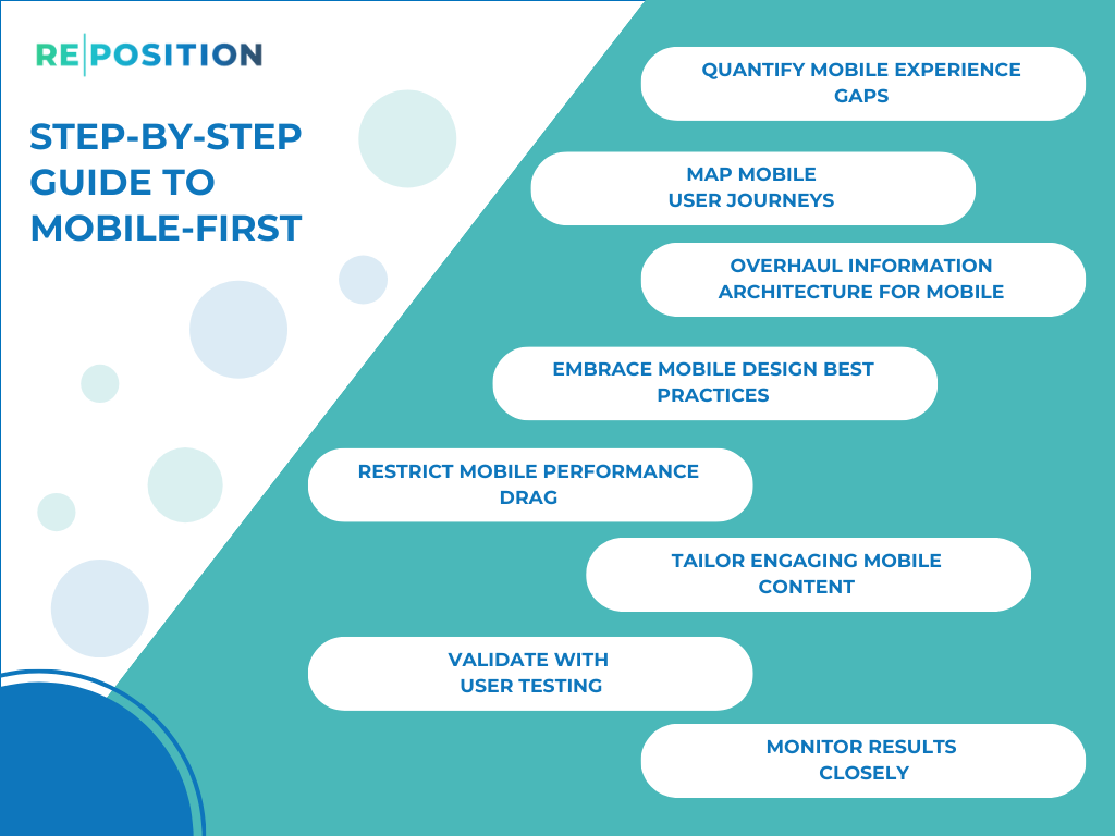
Quantify Mobile Experience Gaps
Start by thoroughly auditing analytics across your domain to quantify precisely how much mobile vs desktop contributes to key business metrics – including traffic share, bounce rate disparities, page speed variance and goal completions. Diagnose exactly where mobile falters most.
Map Mobile User Journeys
Next, work to deeply map actual mobile user journeys by persona examining how key tasks and workflows unfold on mobile screens. Pay attention to friction points, exceptions and breakdowns. Highlight moments failing mobile users across each lifecycle stage to address,
Overhaul Information Architecture For Mobile
With workflows charted, overhaul your site structure, navigation, funnel layouts, form designs and content organization expressly for streamlined mobile usage. Simplify flows to eliminate unnecessary steps on mobile. Sequence pages to reduce context switching.
Embrace Mobile Design Best Practices
With a logical mobile information architecture set, employ established UX best practices to enhance experiences, including:
- Simplified, focused page layouts.
- Clear visual hierarchy and single CTAs.
- Thumb-friendly tap targets and spacing.
- Scaled headline fonts and line lengths.
- Context-aware inputs like number pads on numeric fields.
- Expand/collapse advanced sections to manage length.
Restrict Mobile Performance Drag
Rigorously filter out elements exacerbating download speeds like overly long pages, unoptimized images and expensive script modules on mobile. Set benchmarks for page weight thresholds and defer/remove heavy assets.
Tailor Engaging Mobile Content
With streamlined templates built, refine all text content across pages expressly for scannability and satisfying intent on small touch interfaces. Divide longer sections into digestible paragraphs with regular subheads. Answer questions directly.
Validate With User Testing
Proactively gather mobile user feedback on journeys using tools like Validately to catch remaining friction points. Task testers to complete transactional workflows and iteratively strengthen flows.
Monitor Results Closely
Upon launch, closely monitor key performance indicators across mobile vs desktop. Tweak page-level factors as needed to ensure mobile KPIs steadily improve thanks to ongoing refinement.
Unlocking Mobile’s Full Potential
Following the step-by-step blueprint above empowers any brand to evolve disjointed desktop-first experiences into truly mobile-first journeys optimized to drive outcomes across all dimensions from sales to customer satisfaction.
While an intense focus on understanding and serving the mobile perspective throughout may feel uncomfortable at first, embracing “mobile first, desktop later” thinking will rapidly elevate key success metrics – proving mobile’s profit potential when served flawlessly.
Want hands-on help making mobile’s moment of truth seamless for Asian consumers? Reposition Asia offers full-service mobile optimization support. Let’s explore how we can jointly unlock mobile ROI in Thailand and across the region.
 Request a Quote
 SEO Pricing
 London